Friday, 18 December 2015
My Draft Front Cover
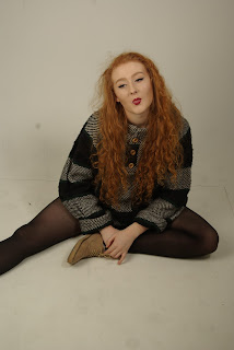
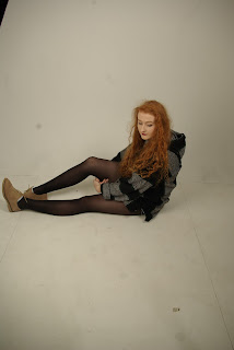
This is my draft magazine cover, I have chosen a back and white gradient background because black and white is seen as very indie and used in many indie music videos (The 1975). I have chosen to use blue boxes around each story to highlight them and make them stand out, i chose blue because when i researched indie colours pastel colour were quite popular. I used a pink box around my X to link with the pink writing of Revolution (the band on the front cover). I decided to have each member of the band in a different position to make each one stand out.
To improve I think I may have retake my front cover picture to make it look more consistent looking, and maybe my background colour.
Thursday, 26 November 2015
Thursday, 1 October 2015
Google Mock Ups
Mock-ups
Double Page Spread House Styles
In each of these double page spreads it is seen that a common theme is to have one full page for an image of the artist and the other page full of the article itself. also it seems common to have a giant letter in the center behind the writing in a bold colour; Red this is because it links to the house style of the front cover and the masthead as the masthead is on a red background. The letter seems to be the first initial of the artist or band e.g L for lady Gaga and J for Jay-z.The font always seems to be the same from the cover to the double page spread.
The size of the font doesn't seem to be any bigger than 11pt.
When the article has ended a common theme seems to be that a bold black line is placed beneath it to signify it has ended.There sometimes seems to be a quote from the article on the picture in bold red writing but it isn't on all issues.
This all creates a house style because it shows common themes throughout each issue of the magazine making these particular things be expected by the audience and if these things were not always included then it would be seen as peculiar and the magazine wouldn't have any theme.
Contents Page House Styles
In each content page a common theme is to have have the issue number on the right page and the logo and the word CONTENTS on a red banner at the top of each page.
Big stories tend to have a picture instead of writing and the other stories are written in columns with the page number to the left of the title, this is underlined by a thick red line with a short description underneath. On the right hand page in the top right corner there is a picture of the next magazine cover to promote a different product, this is a common theme within the magazine.
On the big stories there seems to be a theme to have a large page number to catch the readers eye to direct them to the big stories of the magazine.
There is a common theme to have 3 categories of stories: Features, Q review and Regulars.
This is considered a house style because these are all themes that are seen in every issue, each theme links to the front cover and double page spread as well e.g The colour red is on each of these three pages because it is the main colour of the magazine.
Subscribe to:
Comments (Atom)


