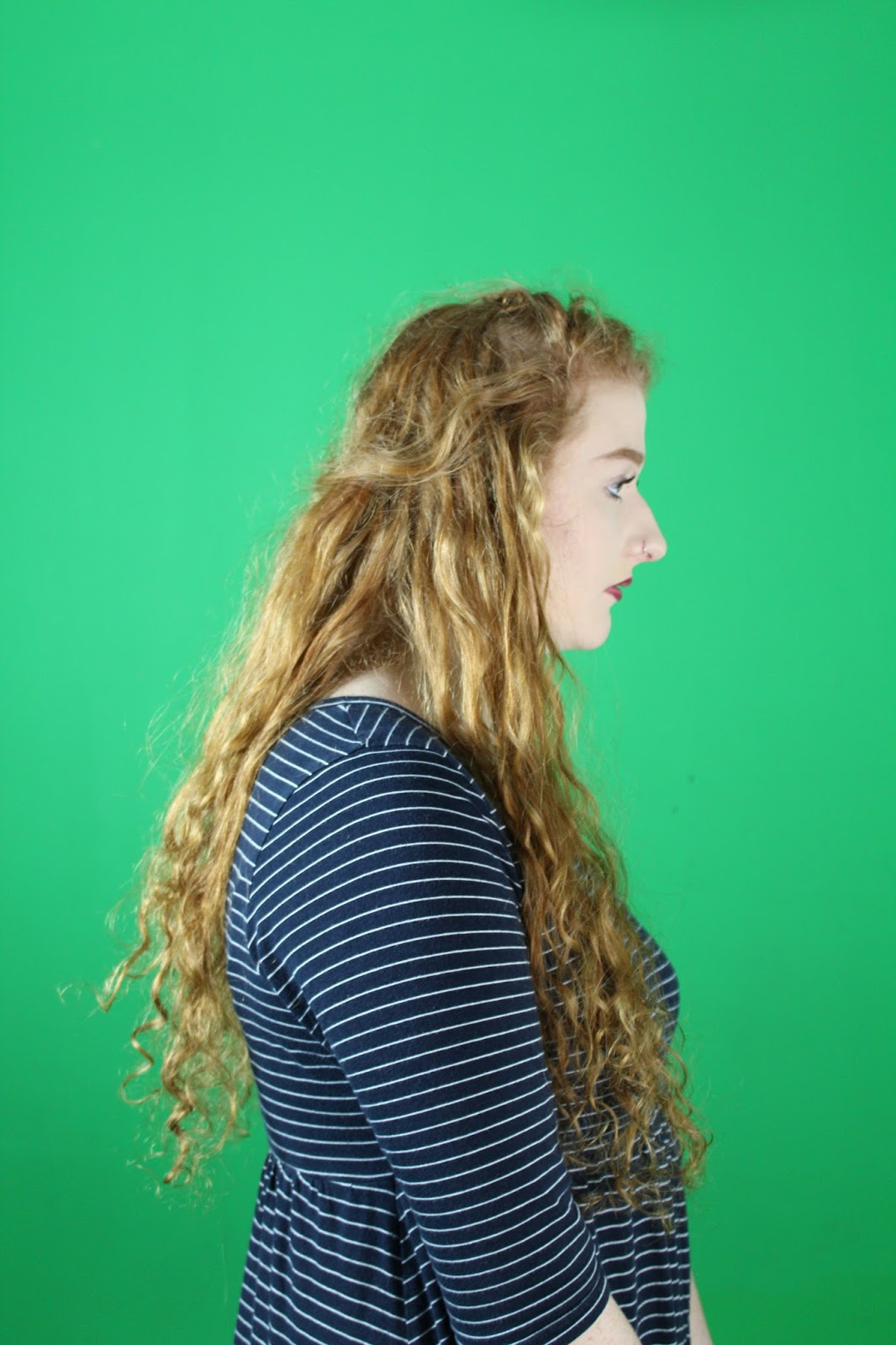
This is my draft of my new front cover, from this draft I can see that I need to unstretch the front image so the model is more inproportion. I need to move the stories so that they are not covering up the models profile images, I need to shrink the masthead slightly so it fits to the page better and does cross over the models head. and finally I need to shade the bottom of the image so that the footer line of text can be seen clearer over the models dress.
Sunday, 7 February 2016
Friday, 29 January 2016
Contents Page and DPS Guidelines
Contents page guidelines
- Multiple images
- If just one image per page, contents should be over 2-3 pages
- Contents page should reflect your cover stories
- The largest image should be the cover star
- Not all contents is on the contents page (majority)
- weekly- should span over about 60 pages
- monthly- 140-180 pages
- divide your contents into sections
- page number- 6 upwards
- elements to include: subscriptions offer
- letter from the editor
- magazine branding- colours and logos
DPS guidelines
- A3 landscape- 300 dpi, RGB
- weekly- page 40 upwards
- monthly- page 90-100 upwards
- big letter at beginning of paragraph- dropped cap or raised cap
- pull out quote
- publisher to place in columns and photoshop for graphics and photos
- columns = no less than 6 words, no more than 12 words per line
Thursday, 14 January 2016
What My Magazine Is Based On
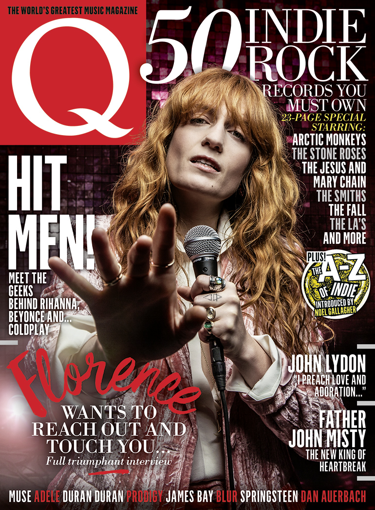
My magazine masthead is based on Q's masthead, as i have chosen only one letter as my magazine name and i have placed it in the left hand corner of the magazine.
my entire front cover will be based on Q because i will be using a large picture to cover the majority of my front cover and i will be using the banner of indie artists at the bottom of the front page, i will also be using different font sizes to indicate the importance of each story.
Friday, 8 January 2016
Images For Inspiration
Chosen images to inspire my front cover images-
I will be using this photo as inspiration for my double page spread, this is because it is quite a large landscape image and also it is very flashy and eye-catching so i think that this type of image will be very effective in a double page spread.

I will also be using this photo as maybe a photo to be featured in the contents page or in the double page spread as well because again it is quite a large image, but this is very simple and eye-catching.
I will be using this photo as inspiration for my front cover, this is because it is a very unique photo, but is also very related to Florence and the machine as a similar image has been used on her album ceremonials.
I will be using this photo as inspiration for my double page spread, this is because it is quite a large landscape image and also it is very flashy and eye-catching so i think that this type of image will be very effective in a double page spread.

I will also be using this photo as maybe a photo to be featured in the contents page or in the double page spread as well because again it is quite a large image, but this is very simple and eye-catching.
I will be using this photo as inspiration for my front cover, this is because it is a very unique photo, but is also very related to Florence and the machine as a similar image has been used on her album ceremonials.
Inspiration For Improvements
Subscribe to:
Posts (Atom)